
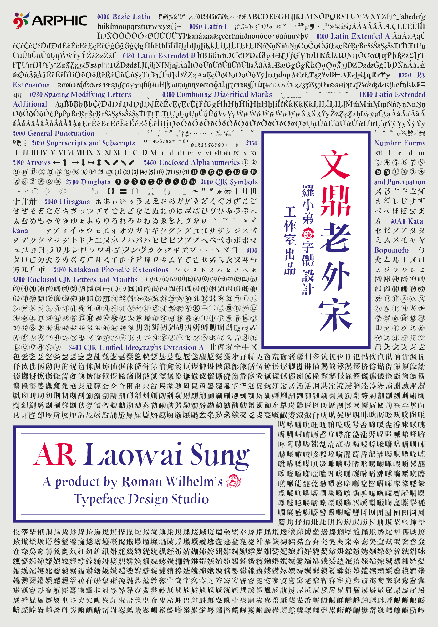
Arphic Laowai Sung (文鼎老外宋), a handmade Chinese typeface
Arphic Type (文鼎字褲), Taiwan, 2015
Check out the music video to the song that evolved parallely to the font! It was written in 2007 in Beijing. Music and video were recorded and produced in the summer of 2015.
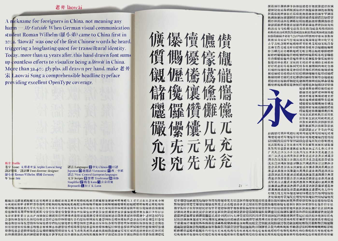
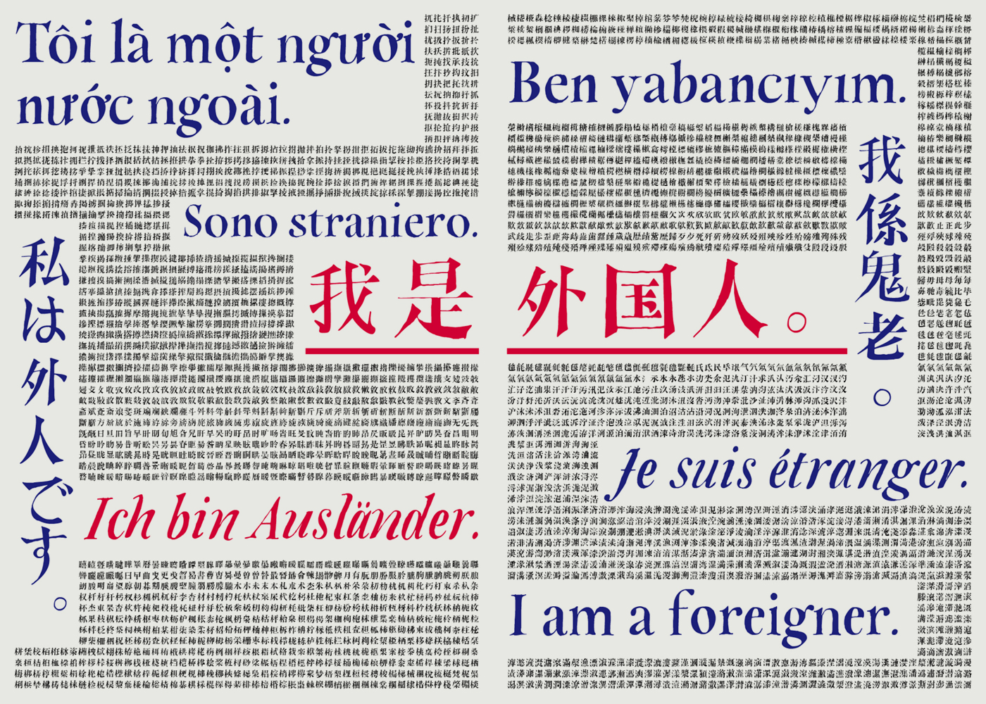
Laowai (老外) means foreigner in Chinese. But I would rather call that a nickname. Literally translated, it means ‘Mr. Outside’. When I first came to China in 2002, one of the first Chinese words I learnt was ‘Laowai’. Though I knew it to be a friendly expression, it also means you will always be an outsider somehow. This awareness made me keep on learning as much Chinese characters as possible, improve my spelling, learn calligraphy... a process which continued to the point when I had to realize that I will never reach the quality regarded as good or authentic by native Chinese. “Laowai Sung” is what I regard a ‘visual capitulation’ to my very own limits.
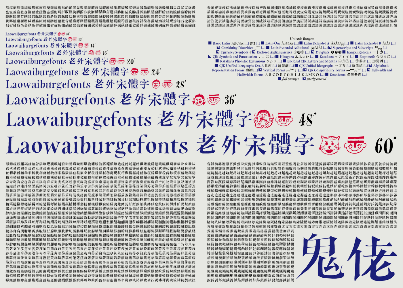
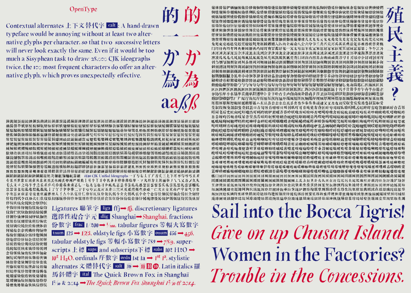
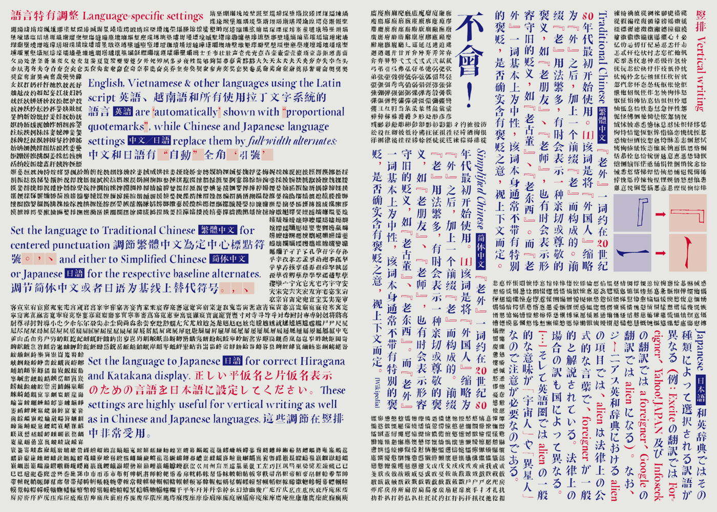
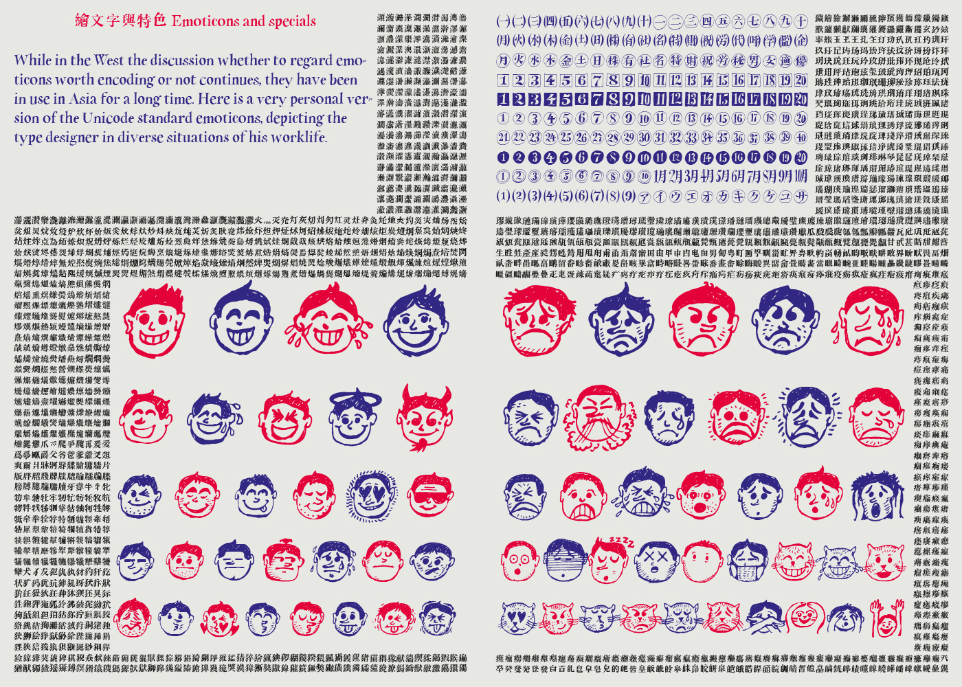
Laowai Sung is a fully handdrawn typeface. Following the Unified CJK Ideographs of the Unicode 6.0 standard, I spent four years filling a grid of fourty characters per page in an A4 sketchbook, then proceeded to scan and vectorize them. Alltogether, the font contains more than 32,400 glyphs, including Vietnamese Latin, Thai, Japanese Kana, enclosed forms and emoticons. I took the freedom to slightly mingle Taiwan, Hong Kong and Mainland design standards and intentionally make a clear localization difficult.
Laowai Sung won the bronze award of the Hiii Typography Competition (2013) and was selected a prize nominee work at the Tokyo Type Directors Club (TDC) in 2014, being included in the annual exhibitions in Tokyo and Kyoto. It is now out for sale at Arphic (Taiwan) on their updated iFont Cloud webfont service, to be followed by a print font.
Here is a video of a talk (in German) I held on the story of Laowai Sung at the Berlin Creative Morning on January 15, 2016, hosted at Wooga, Berlin.
Type, Kontext, Schriftkultur – Schriftgestaltung zwischen Europa und Ostasien (Vortrag auf Deutsch). Wie kommt man als Nicht-Asiate dazu, asiatische Schriften zu gestalten? Welche gestalterischen und technischen Problemstellungen ergeben sich im Kontext „CJK“ (Chinesisch, Japanisch, Koreanisch), welche Konsequenzen haben sie für das ästhetische und kreative Selbstverständnis? Am Beispiel seiner ersten chinesisch-japanischen Schrift „Laowai Sung (老外宋)“, die 2015 bei Arphic (Taiwan) veröffentlicht wurde, erläutert Roman Wilhelm die Signifikanz dieser Fragen. Nach 5 Jahren Arbeit und mehr als 33.000 Glyphen gibt es viele Erfahrungen zu teilen: über Proportionen und OpenType-Features im Multiscript-Typedesign, stilistische Migration, CJK-Webfonts, Fragen der Vermarktung, Rezeption und Prämierung sowie die Rolle des „Fremden“ im Kontext des „Bekannten“.

 Sound 聲音