Sound 聲音
This page contains a transcript and a little additional information to my ATypI presentation on September 14, 2018 at Arenberg Theater, Antwerps. Thanks to everyone listening! Here is the original programme summary:
Belgium unifies Flemish, French, and German speakers. While these languages are assigned to distinct regions (Flanders, Wallonia, and a German-speaking community), the capital of Brussels is governed multilingually. Brussels also hosts leading European Union institutions, making Belgium a place of true importance for multilingual policy studies. During my ongoing research of history, practice, and theory of multilingual typographic media, I noticed that the methodology of putting different languages and scripts into a mutual context can be studied from a variety of Belgian typography samples – from historic printed matter such as Plantijn’s famous polyglot Bible of 1573 to modern-day signage systems or legal documents. Detailed analysis aims at revealing the motivations leading to the complex task of multilingual media production, the methodology used to achieve it, and, especially, the “togetherness” of different languages, scripts, or writing systems. What significance does this togetherness transport on the backdrop of changing political contexts? Belgium is a crucial place on the quest for the meaning of multilingual media in the EU: in a time of growing concern with Euro-skepticism and protectionism, do multilingual media express European unity or division after all? Can they provide transparency to put opinion-making into a European perspective?
The Biblia Polyglotta was printed in 1573 by French-born Christophe Plantin, Antwerp's most well-known printer and type-caster, consisting of five languages in its entirety of eight volumes (Old and New Testament differing from one another). In order to be commissioned by Catholic king Phillip II to do this highly complex job, Plantin first had to ‘chase away’ some of his clients supporting the Prince of Oranges. Much more should be said about the various aspects shown here, but that will only be possible in a more complex, written medium.
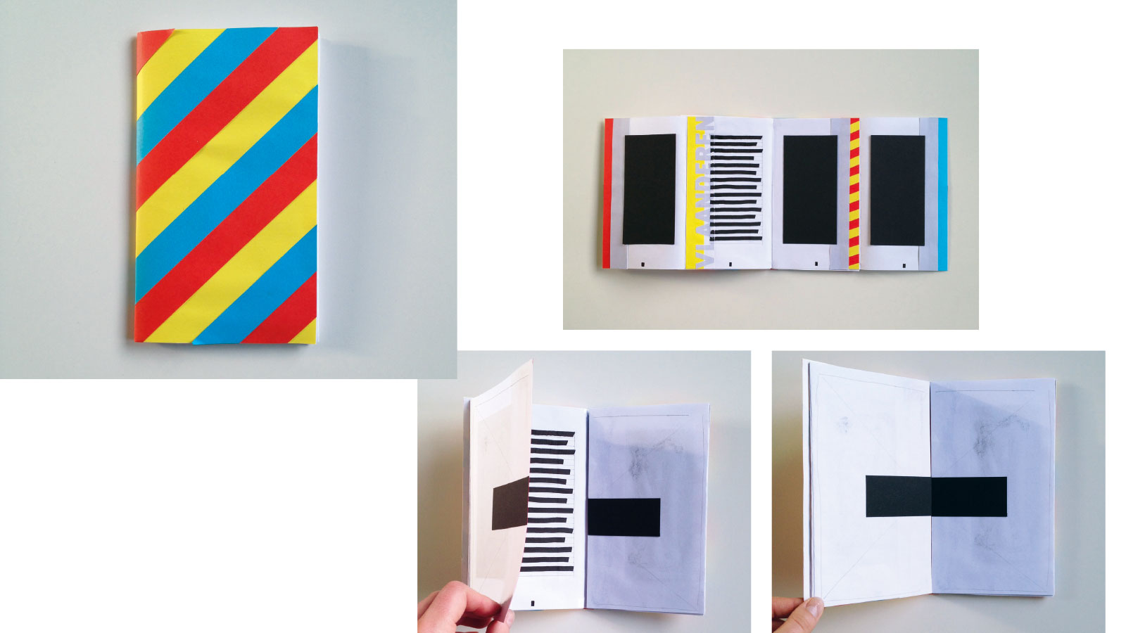
Part one: “1+1”

1. Many online media are multilingual, but we pay little attention while choosing a language. In multilingually-governed states such as Belgium or Switzerland, ‘flag icons’ are not used for this purpose, since the languages obviously share one and the same national flag.

2. When we take a look at media where efforts were made to display several languages together by means of harmonised typography, we see that one plus one…

3. …has to be more than just two: The impact of the ‘togetherness’ of several languages or writing systems in one and the same typographic framework adds to the narrative—visually as well as in terms of meaning.

4. But this information surplus is hard to be clearly determined or calculated, depending rather on the individual cultural and linguistic sensitivity of the reader.
Part two: “A look back, far away”
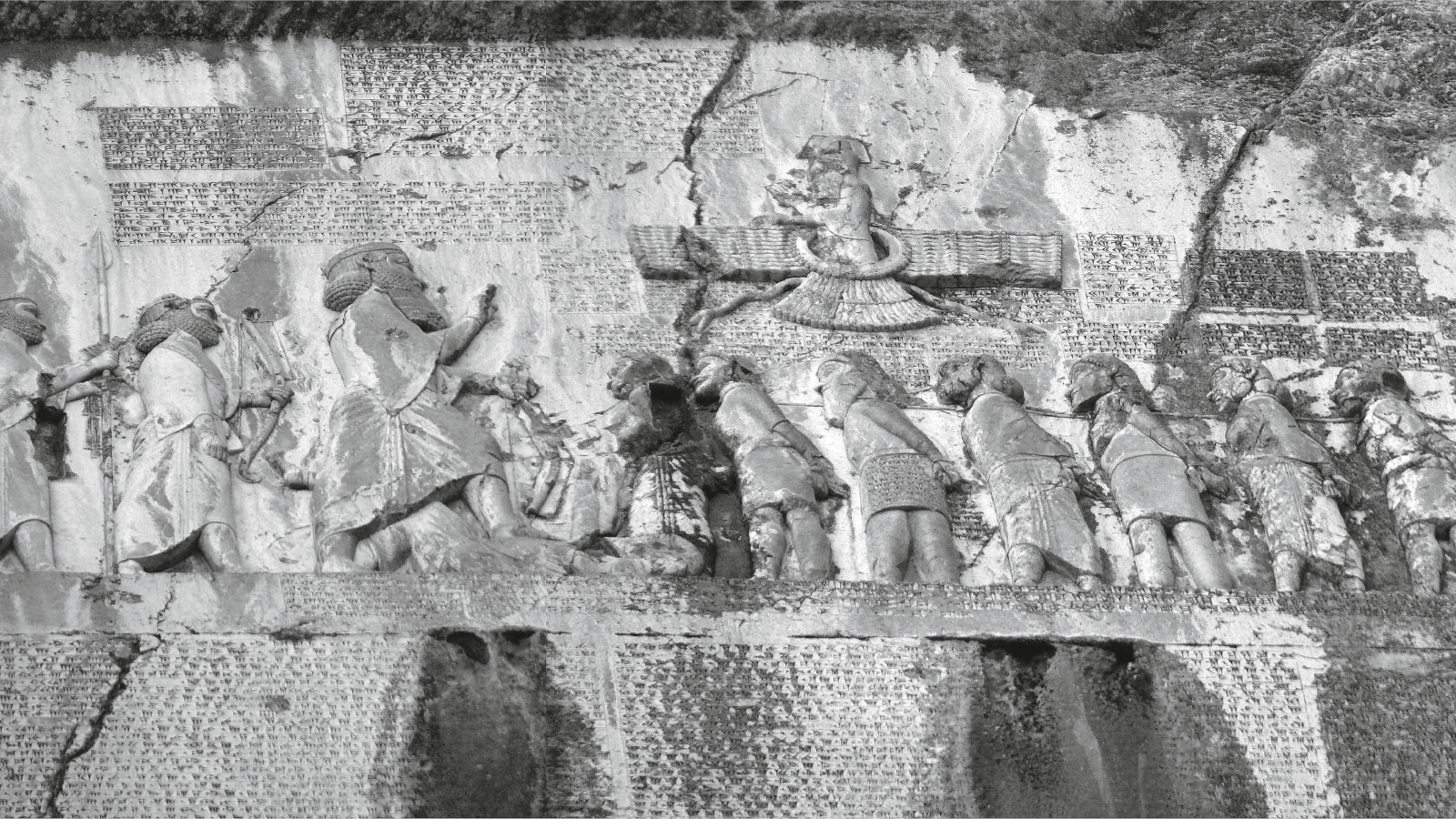
5. Allow me to start completely off-topic—multilingual media have always been a complex affair, in Belgium same as in far-flung ancient Persia. The Behistun inscription for example, commissioned under Darius the Great, contains three languages: Old Persian, Elamite, and Babylonian—the main languages of his new empire (image source: Wikipedia commons).

6. In the captions to the relief, Persian, official language of the court, highlighted in orange here, is mainly positioned on top, the Elamite below (blue). Babylonian paragraphs (green) are more loosely attached. The images depict a Faravahar, symbol of Zoroastrism (top center), and Darius the Great with two servants (left), stepping on the usurper Gaumata overthrown by Darius (lying figure), along a queue of captives symbolizing communities incorporated into the Empire. In modern research, Gaumata remains a highly controversial figure.

7. The macro-layout leaves the best spot—directly underneath the relief, as much as the rockface allowed—to the Persian text (orange), followed by Elamite on the right-hand side (blue). The Babylonian version has to content itself with an uneven rockface on the left-hand side.

8. A few years pass. The Elamites rebel. Another people is conquered. A new figure has to be added. The Elamite text has to move to the lower left, destroying the original symmetry. What a mess! Those in charge of planning the new inscription were literally between a rock and a hard place. The lesson learned absolutely equals to present-day typographic practice: Think twice before starting a multilingual project.
Part three: “Polyglot”
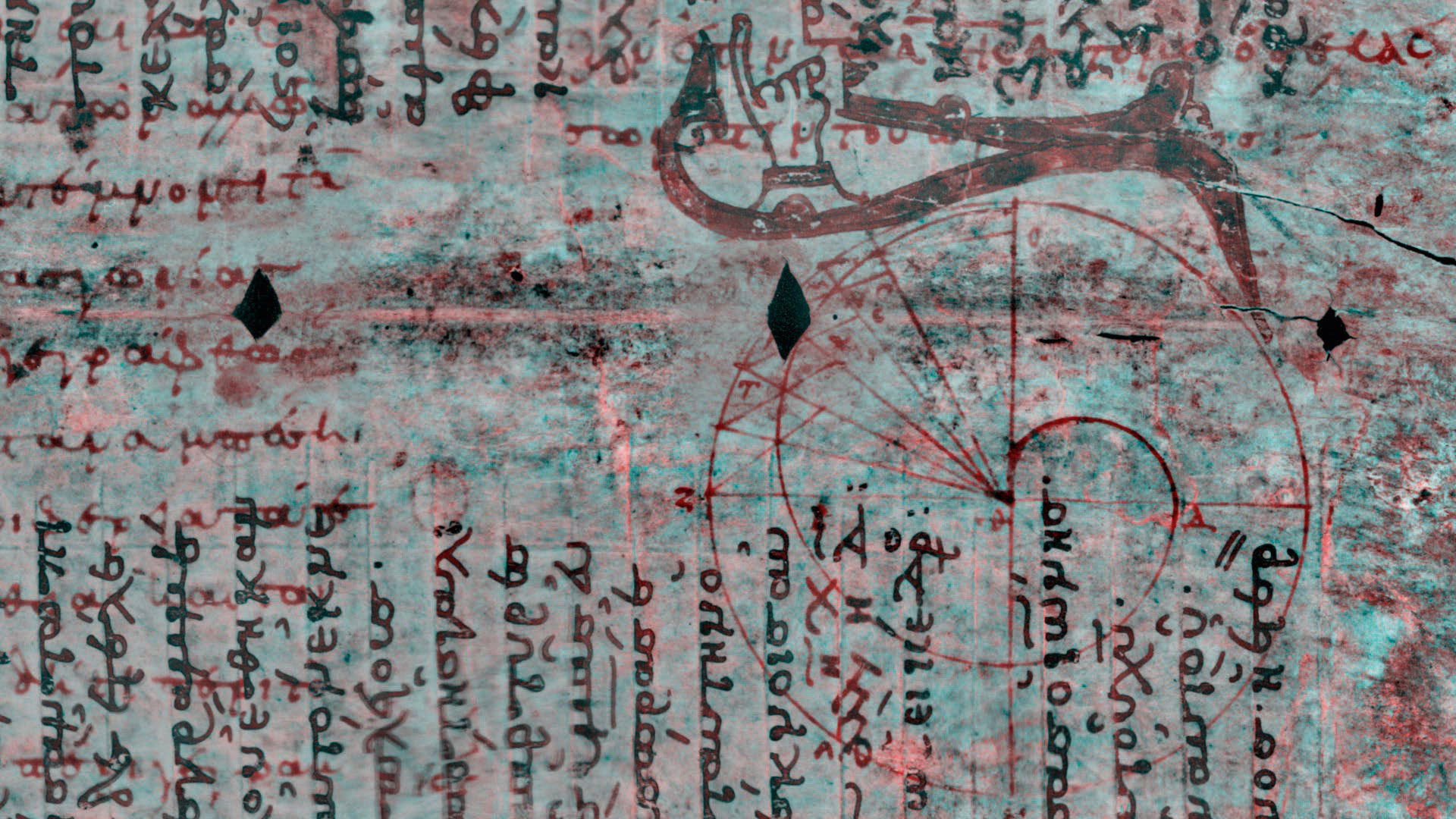
9. Palimpsests are often multilingual, though unintendedly of course. Content censored by the church was scraped off the precious parchment for reuse. Probably for the sake of legibility, new content was often written in a 90-degree angle to the original writing. Thanks to UV technology, the original texts now can finally reemerge between the lines (image source: Wikipedia commons).
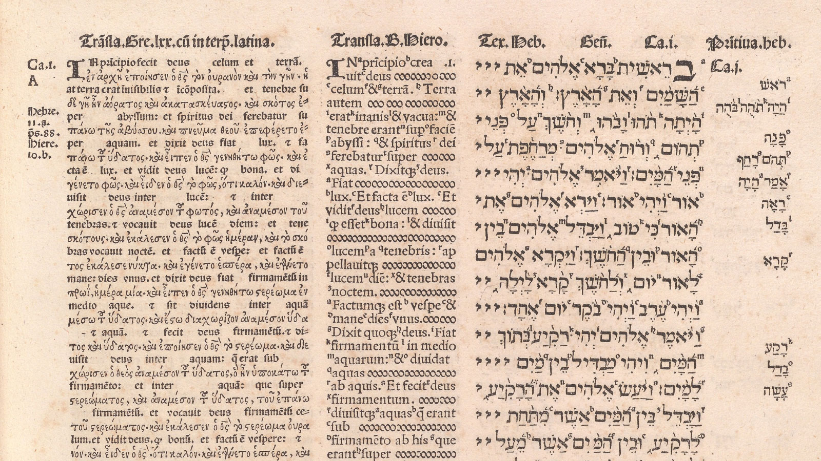
10. Polyglot bibles, the one here in Antwerp being merely one of a few at the period, express the willingness of the Catholic church to debate about the meaning of the Word, though well within the scope of safely canonized texts. This example from Spain was produced 50 years prior to Plantin. Here, the Hebrew text is flanked by a Latin translation (center), the Greek version with a Latin interpretation (left)–languages switching sentence by sentence, therefore creating a time-based, sequential narrative. But look: the Latin text is interrupted by ornaments to keep flowing with the Hebrew. Tell me who wants the Word of the Lord to be interrupted by … foam bubbles? That’s one of the problems we still face today: Full consistency at the expense of reading flow, or generalisations at the expense of accuracy? We learn quickly that a particular decision often comes at the expense of something else (source: Francisco Jiménez de Cisneros, Diego López de Zuñiga (1514-17): Bible. Polyglot. In Academia complutensi. Image source: Yale University Library).
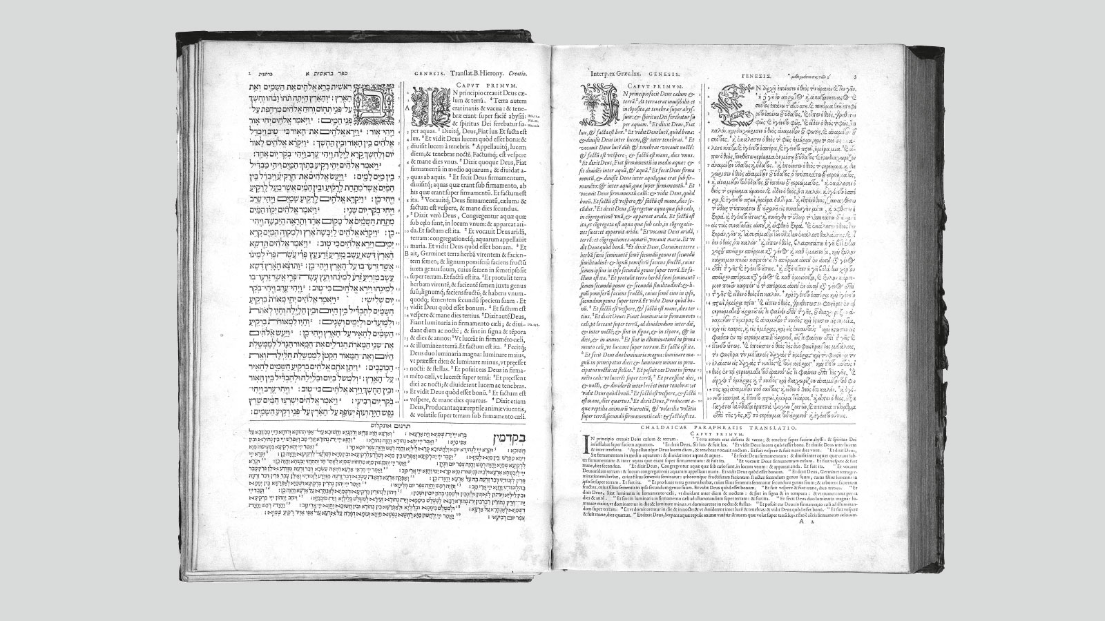
11. Christophe Plantin did just that. He found a compromise to clean up the whole layout and make it more digestible by moving the third column to the base—to the expense of the poor Chaldeans (Chaldean: the third language appearing in the Old Testament of the Antwerp Polyglot)! But there are other aspects making this kind of project complex at the time: Latin and Greek type was already at hand, but Hebrew matrices had to be imported from France (cut in 1559 by Guillaume Le Bé (1524/25–98), same as the Syrian (cut by Robert Granjon). On top of that, Plantin had to chase away his Calvinist customers to get the job in the first place! (image source: Wikipedia commons).

12. The genius thing is—when you isolate the typographic borders—an optical triangle is emerging from every page, helping the languages and scripts to come to peace with each other a little. And we know the role of invisible triangles in the art of the period.

13. Multilingual typography is not always multi-script (like here in present-day Belgium, where it isn’t, same as in Switzerland). The Polyglot Bible is. However, if you highlight the three different scripts used in the Old Testament (the New Testament being treated differently), no proper meaning is visible at first glance.

14. Again, the borders are here to help, not dividing, but connecting the language pairs, even with two reading directions—but at the expense of the Hebrew page order! By this detail, we can clearly see this bible was mainly designed to be used by Catholic scholars, commonly exchanging in Latin at the time.

15. But you also have to think of the hierarchy between original versions and their newly-edited Latin interpretations. Here, the layout works much more symmetrically.
Part three: “Europe”