Code Switching, Multi-Style, Diglossia:
On the Convergence of Blackletter and Roman Fonts in Early Prussian Typesetting,
1530–1806. History, Theory, Typeface Design Practice
This page contains information on my abstract for ATypI 2016 in Warsaw. For appropiate OpenType coverage, this page is viewed best using Mozilla FireFox.
In 16th-century Prussia, letterpress was widely used as a mass medium to spread new religious and academic concepts (mainly of the growing Protestant faith and pietism). During a timeframe of roughly 250 years, books and leaflets were printed in various letterpress offices, centered around places such as Halle (Saale), Gdansk, or Koenigsberg (present-day Kaliningrad), the latter being of special historic interest for her role in Polish and Lithuanian publishing. While the whole region served as a base for protestant missionaries, she was also an exchange hub for scholars from all origins.1
In the 17th and 18th century, Latin was still a vidid world language used by scholars throughout Europe. During this period, peaking in the 1690s, Roman typefaces were used within the context of the common German blackletter to distinguish words or parts of words from Latin or Romance origin. The decline of ‘style-switching’ in later Prussian letterpress converges with the growing dominance of the national languages in printed media, gradually amplified by increasing nationalism in the respective countries.2
A map (without borders which have drastically changed over time) of the historic region of Prussia, Poland, Lithuania.
Contrary to Meiji Japan, where an existing script (Katakana) was standardized to spell all non-Chinese loanwords, Prussian bookprinters used ‘style switching’ to provide the desired linguistic clarity. Being a part of my current research on multilingual typography, I would like to share a theory which may be of special interest to methods of republishing and re-contextualizing original material from this context.
The phenomenon is well-rooted in contemporary discourse3. However, it is either rarely contemplated that the German-speaking community, contrary to speakers of Roman languages, had adopted Latin as a distinctively foreign language, encouraging them to develop their own unique way of typographic mark-up. Apart from that, blackletter typography was also temporarily common to Polish and Lithuanian media. I am, in turn, discussing this complex of subjects under the wing of multilingual typography, because Latin was, even though a firm element of written German, regarded an international language (‘lingua franca’) before the early 1700s.4
The first sample was chosen to show a strong sense of the style-switching/multi-style phenomenon.
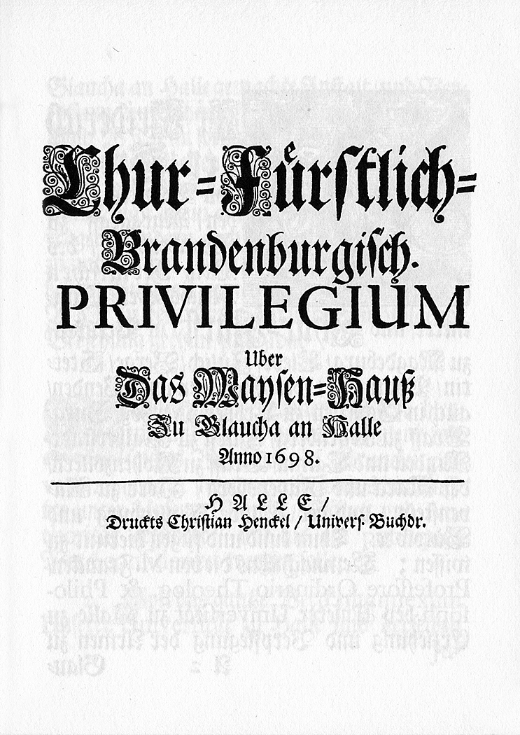
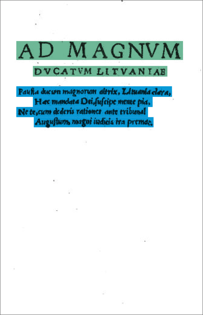
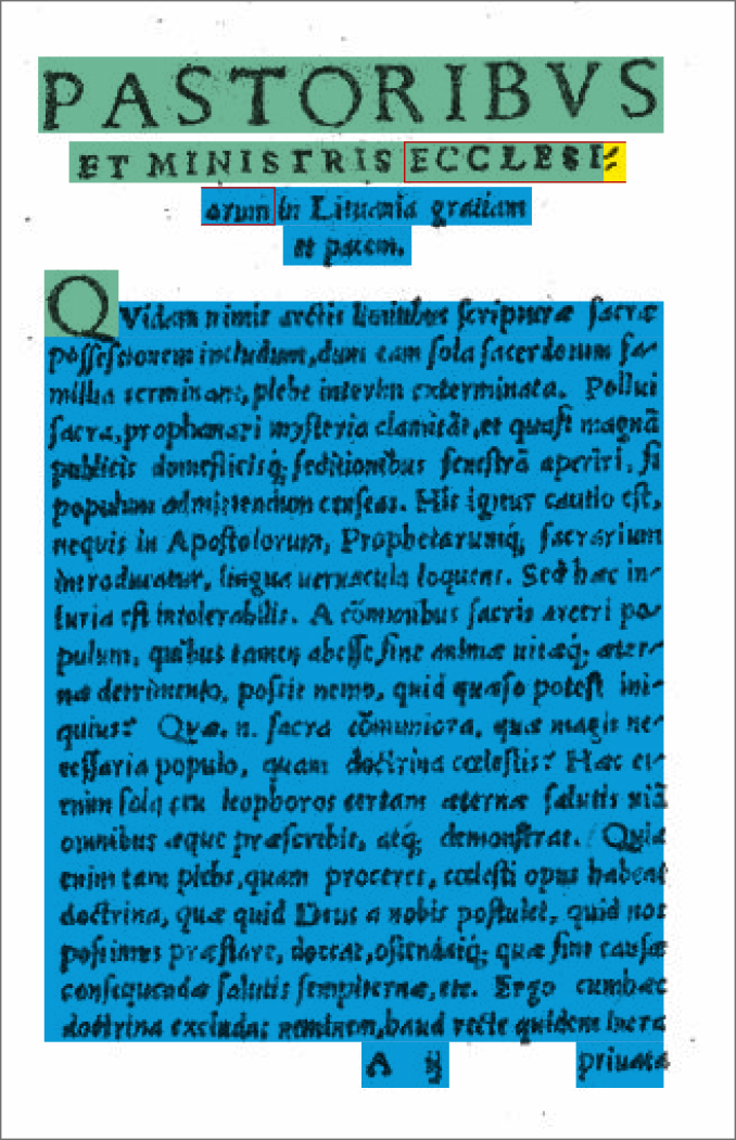
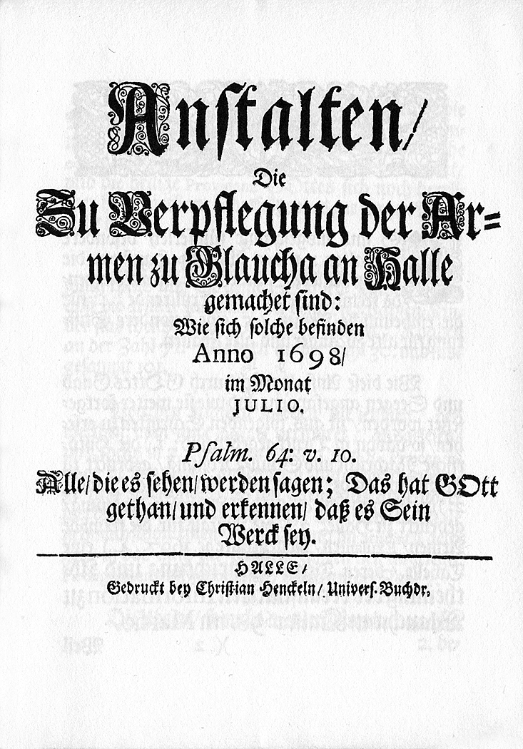
Sample 1 – Francke: “Anstalten /Die Zu Verpflegung der Armen […]”. Halle (Saale), 1698.
This 20-page brochure (1698) by August Hermann Francke (1663, Lübeck – 1727, Halle), director of the orphanage “Franckesche Stiftungen” in Halle (Saale), then part of Brandenburg-Prussia under Frederick III (1657–1713, the later king Frederick I in Prussia) could be regarded today as a ‘business plan’ for the newly founded institution. It was printed in situ by Christian Henckel, university letterpress printer. The following images were taken from a reprinted copy available in the museum shop.5
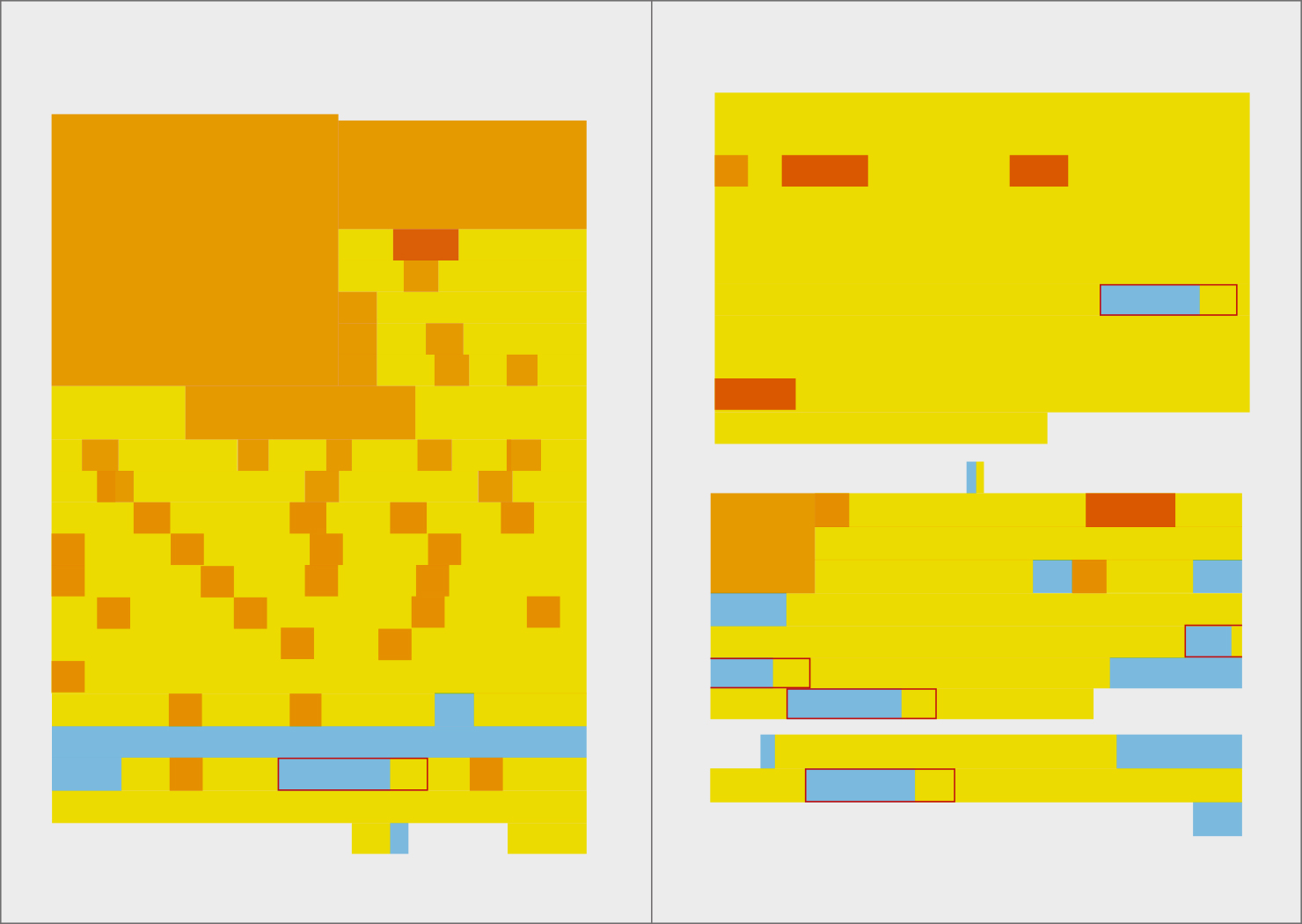
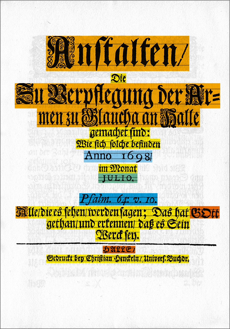
Cover page, original black and white.
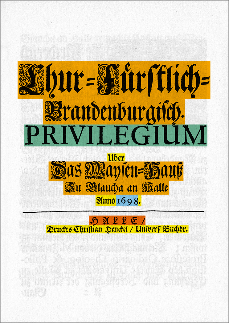
Color analysis on original page.
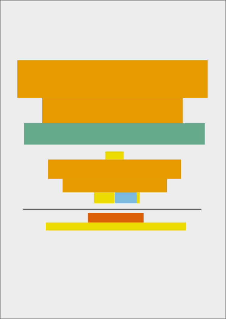
Color analysis, detached.
The cover page, originally printed in black and white. To save some space, these original images are not further shown here. However, please do have in mind that all the media presented on this page consist exclusively of black ink on paper, set in moveable type, lines, and clichees, on a single printing block. The additional colors serve for analysis only, though I am aware they do interfere with the original aethetics of the media.
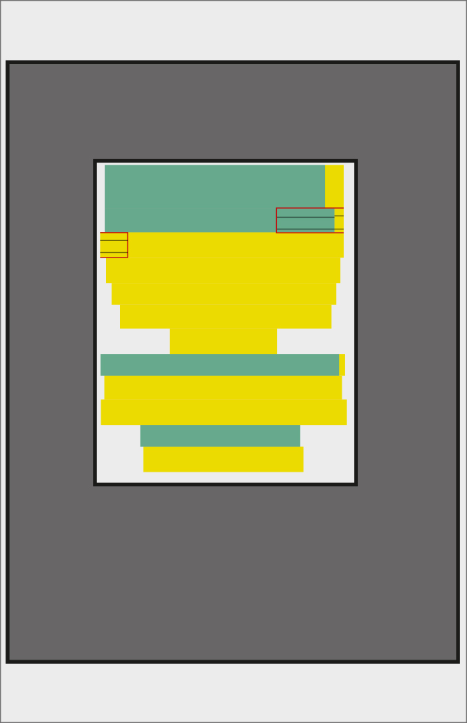
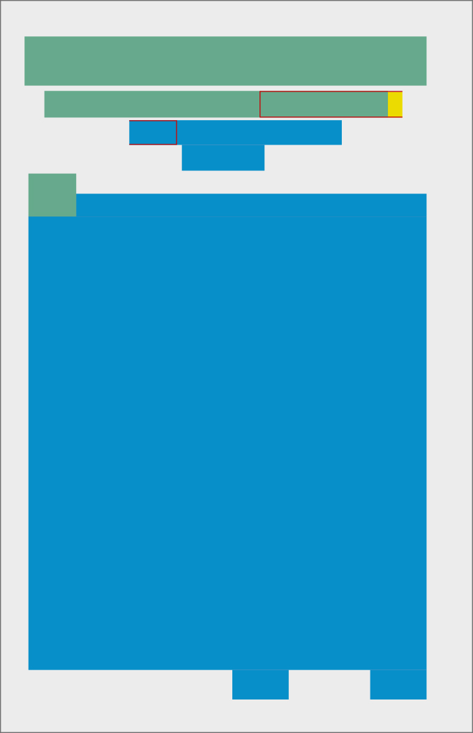
The colors represent the following stylistic elements to be distinguished here: Blackletter text type of various sort. Flourished blackletter (emphasis or headline). Other emphasis, such as capitalization of full words or parts of words. Roman serif (and Arabic numerals in the same style) of various sort. Emphasis in Roman italics. Emphasis in Roman capitalization. Images, clichees.
Rough baselines and x-heights are partly added to highlight diffences in type size. Style-switching within words is shown by a red box highlighting the word as a unit.
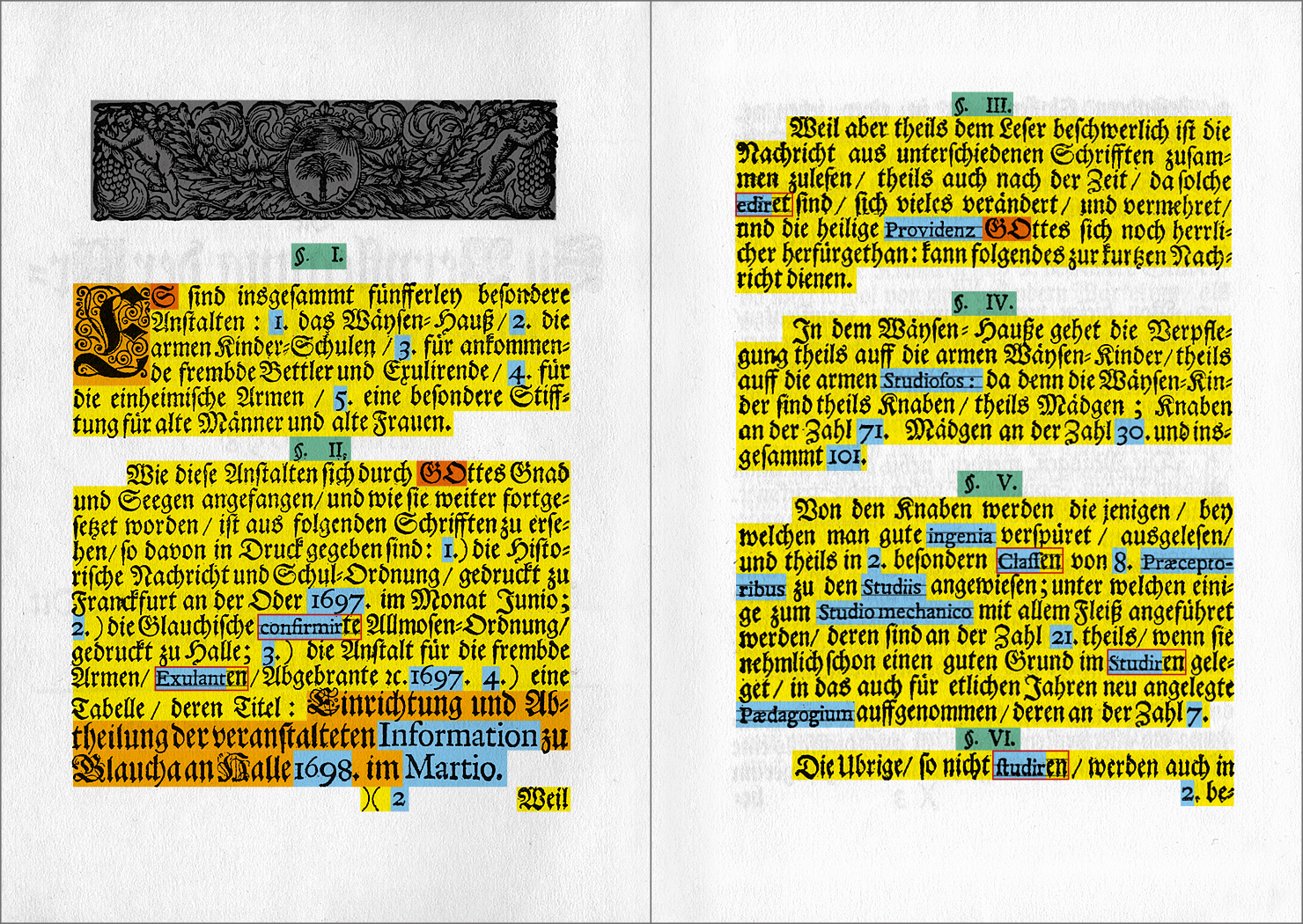
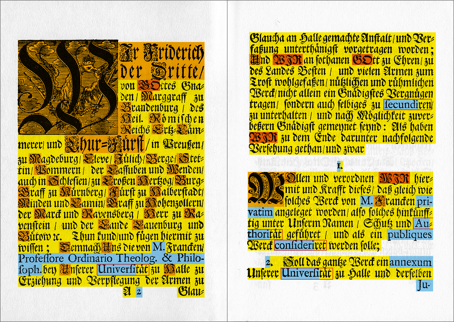
Pages 2–3.
Pages 2–3, analysis.
Although the Arabic old style numerals seem to be set as a part of the blackletter typeface, their visual appearance is not adapted to the aesthetics of blackletter, as can be often found in later samples. In this medium, two distinct type sizes are used for the running text, wherein the small size manifests a difference in character height, the Roman being significantly smaller. This especially affects the Latin-German composites such as “confirmier/te” (the root coming from Latin “confirmo”, the latter being the German preterit suffix), adding a bumpy impression to the typography. However, this is not repeated in the larger sized parts of the text (emphasis), wherein the x-heights of blackletter and Roman are approximately equal.
Pages 8–9.
Pages 8–9, analysis.
Roman text is hyphenated by Latin-style hyphens, while otherwise blackletter-style ‘double hyphens’ are used. However, these practices are never consequently realized through the whole medium, as can be seen on the following pages. Upper case emphasis is used in both styles, only for different purposes. In Roman, i.e. for section heads; in blackletter, to highlight essential religious terms such as “GOtt” (GOd) or politically motivated elements like the aristocratic “WIR” (WE). However, flourished blackletter caps (to add a notion of importance to some politically important text parts), is in lack of a Roman equivalent.
Although there are some exceptions, it can be clearly stated that interpunction following a Roman section is also set in Roman. This habit is not valid for the numerals within running text, though.
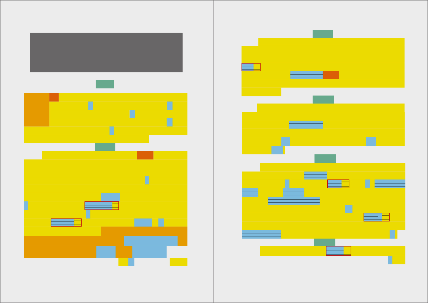
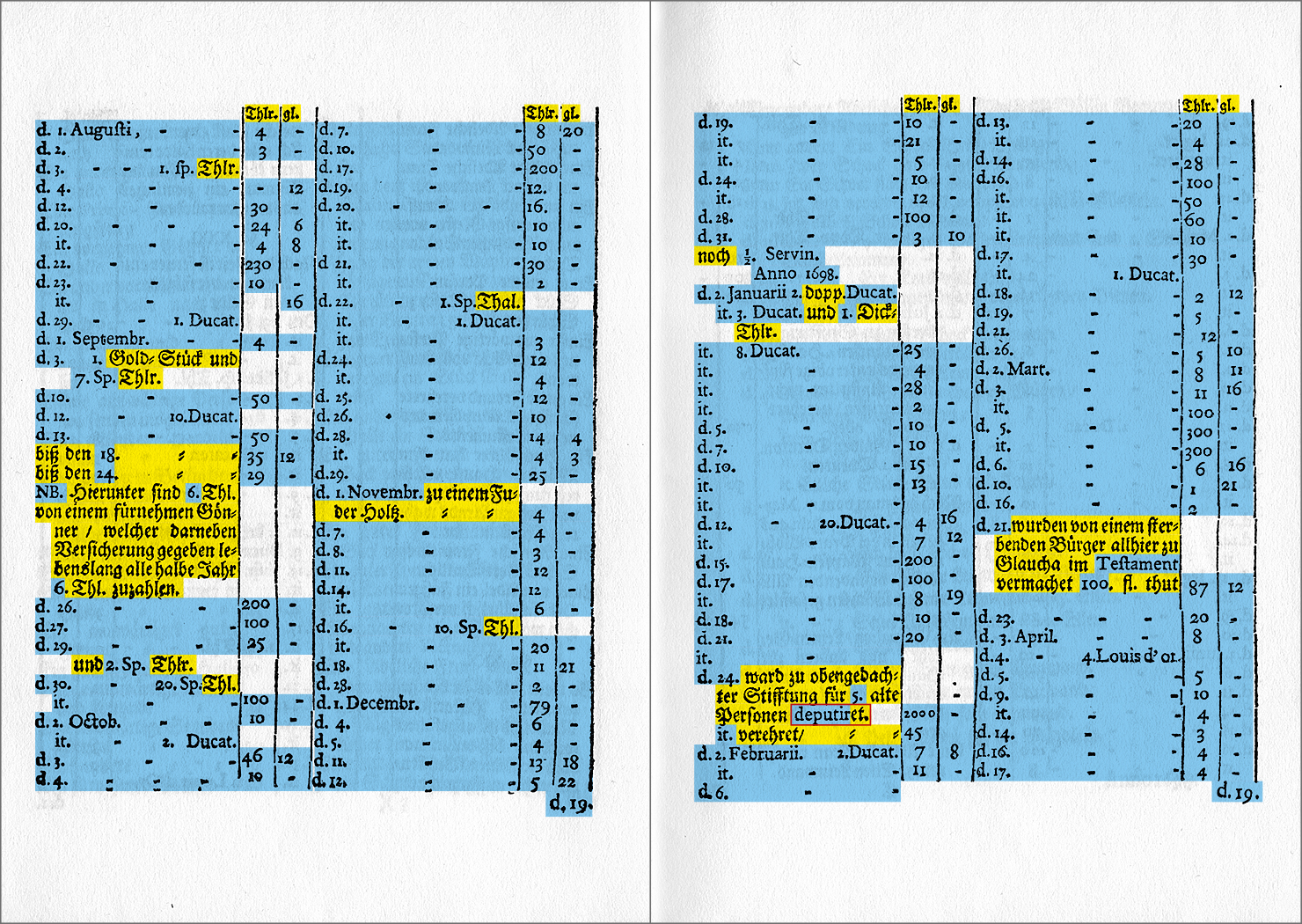
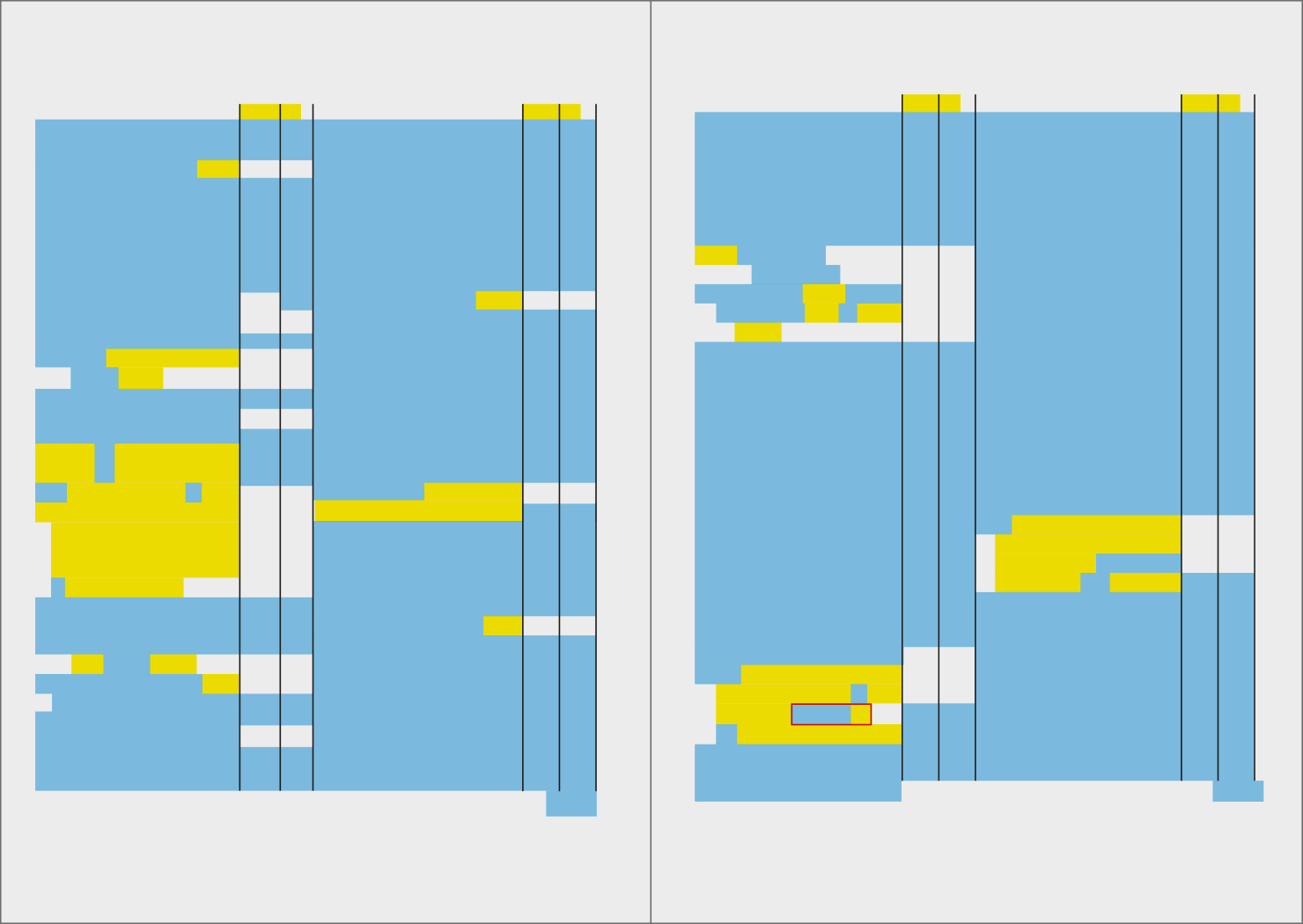
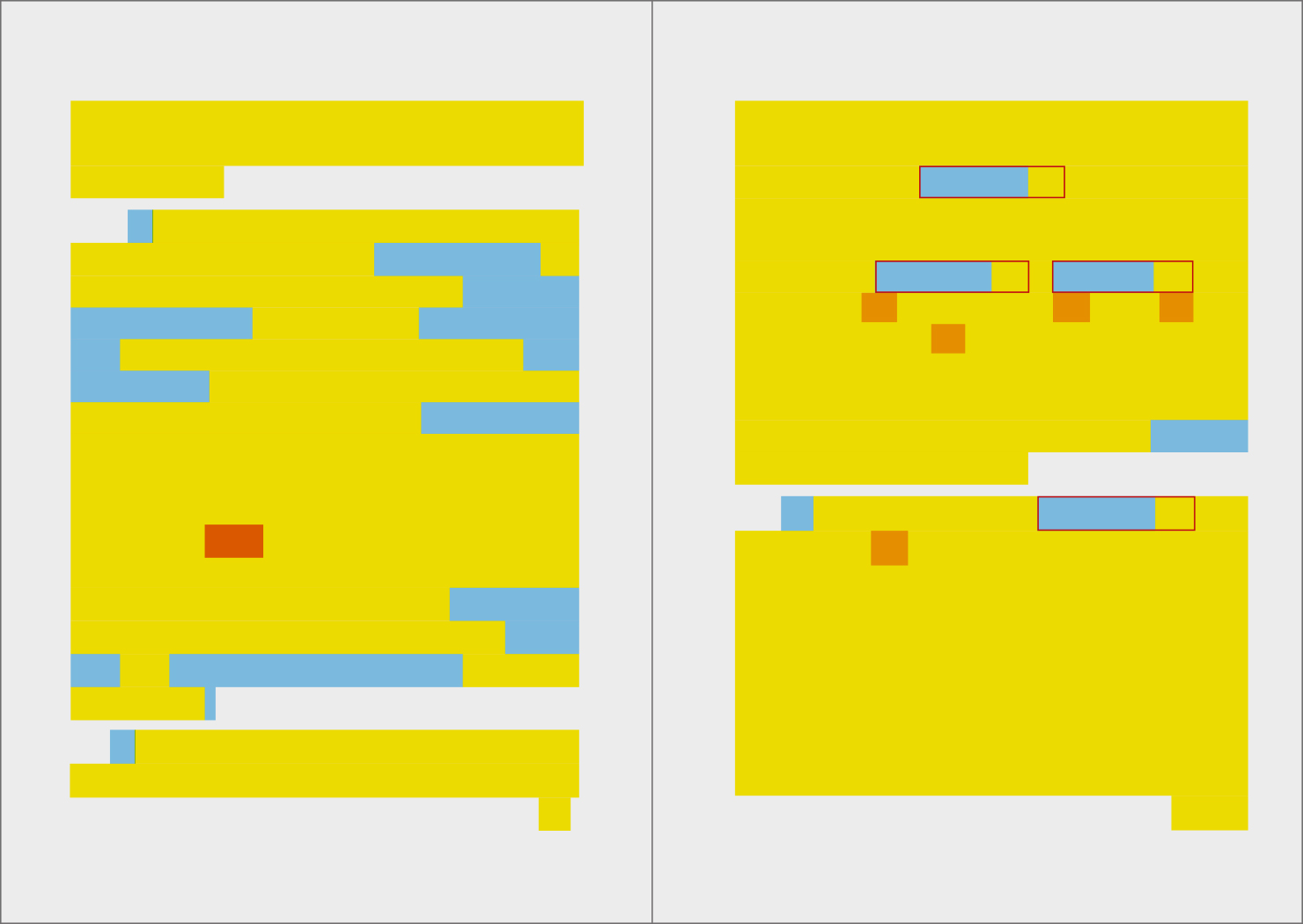
Pages 14–15, list of donations to the orphanage (excerpt).
Pages 14–15, analysis.
As soon as a page is dominated by figures and dates, such as in this list of donations to the orphanage, the appearance changes drastically, letting Roman type play the dominating role, only to be interrupted by blackletter elements. An increased use of Roman interpunction can be observed, though, again, not fully done.
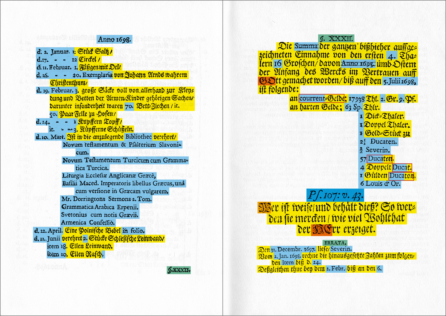
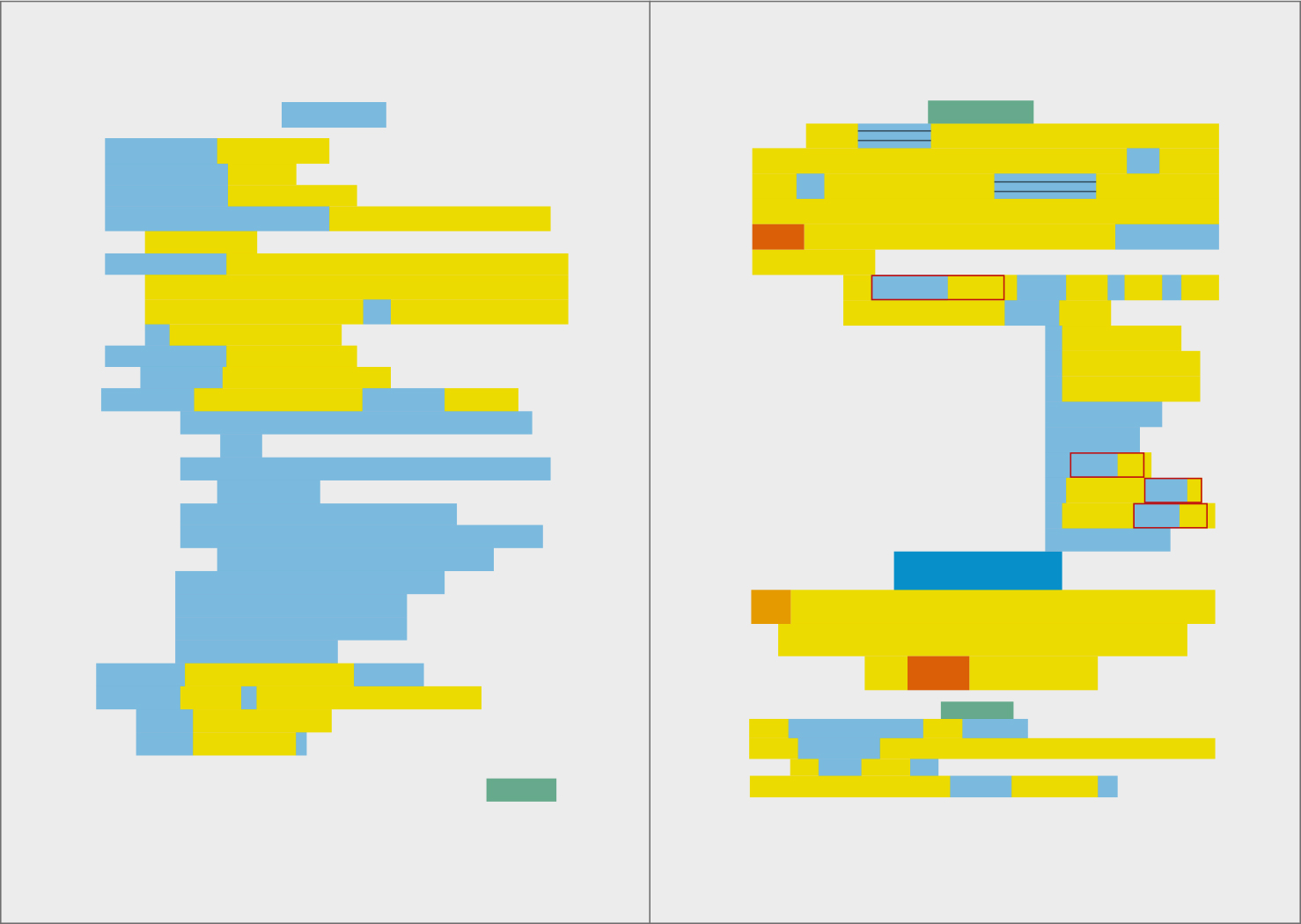
Pages 18–19, list of donations, (excerpt), income declaration, errata.
A 14-page concession (grant of rights) issued by Frederick III to August Hermann Francke for his orphanage in Halle (Saale), printed by Henckel as well, is different in terms of bigger type sizes and frequent usage of decorative forms to emphasize representative and administrative aspects. These stylistic mark-ups are, however, not present in the Roman parts of the text, although they would have been technically possible (i.e. by usage of italics or swash forms).
Cover page, original black and white.
Color analysis on original page.
Color analysis, detached.
Pages 2–3 with heavy usage of decorative blackletter forms.
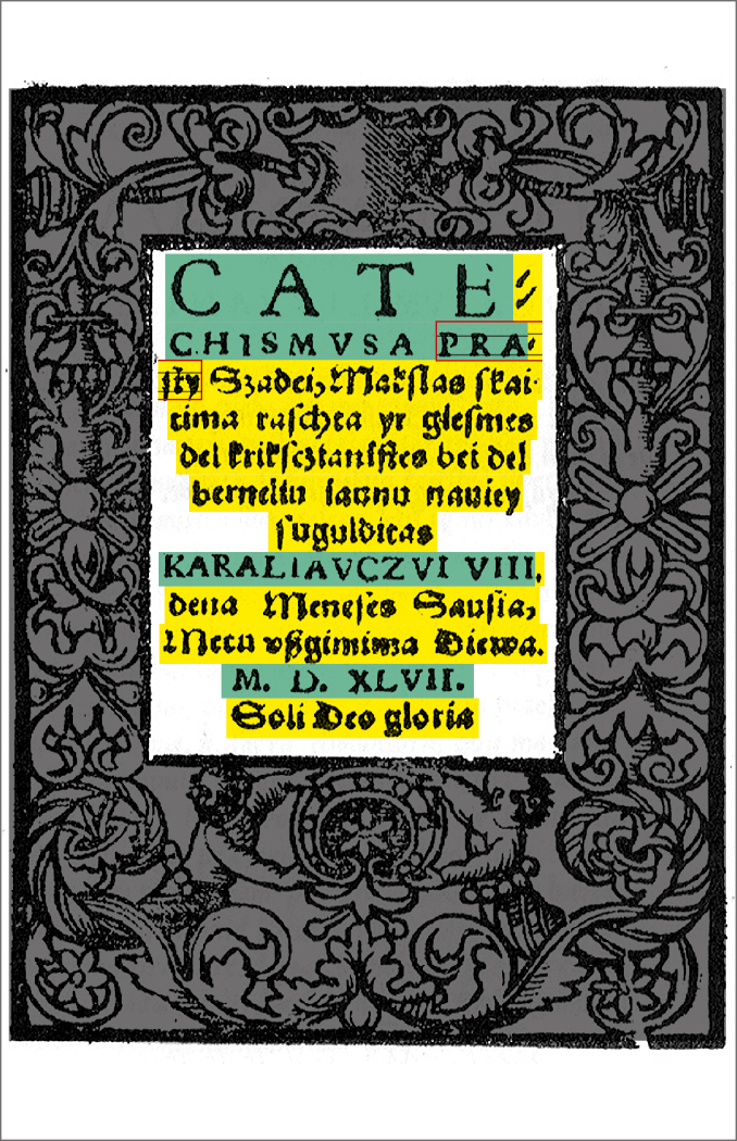
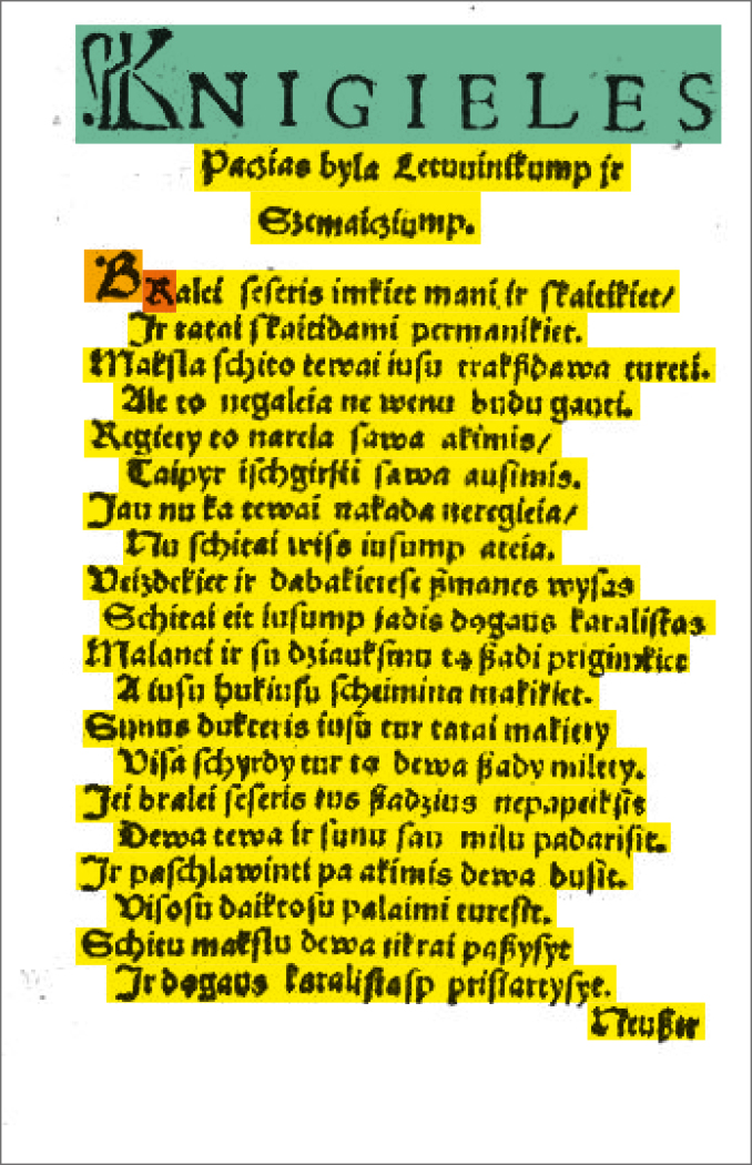
Martynas Mažvydas, a Lithanian priest with a degree from Albertina University in Koenigsberg, edited and published the first printed Lithuanian book, a translation of Luther’s “Small Catechism”, in 1563. The book was printed in Hans Weinreich’s Königsberg-based letterpress office, using Schwabacher for the Lithuanian, and Roman for the Latin passages, but, again, not fully consequently, as already the cover page shows.
Cover page, color analysis on original page.
Cover page, analysis.
Right at the start, blackletter hyphens are combined with Roman capitals. Roman type is used for Lithuanian words, apparently to monumentalize the main term “catechismusa”, but not to emphasize a linguistic aspect. The following hyphenation then only makes sense when done out of formal (not to say aesthetic) reasons:
PRA-ſty
German phonetics were used to spell Lithuanian, such as raſchta, which would today be spelled “rašta”, or ußgimima for “užgimima”. The sz-ligature ß was still seen on Lithuanian blackletter newspaper heads as late as in the early 20th century.
Dedication page (fully Latin).
Analysis.
Introductory text (fully Latin).
Analysis.
Lithuanian page.
Analysis.
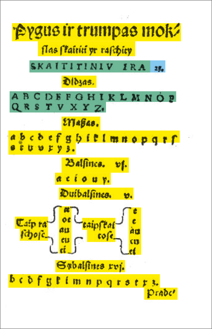
Display of Latin letters.
Analysis.
Samples 4 and 5 – Bilingual typography and style-switching in Prussia.
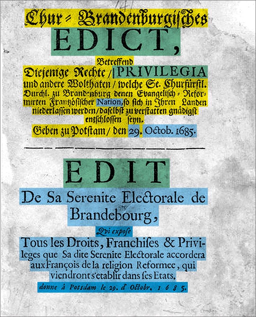
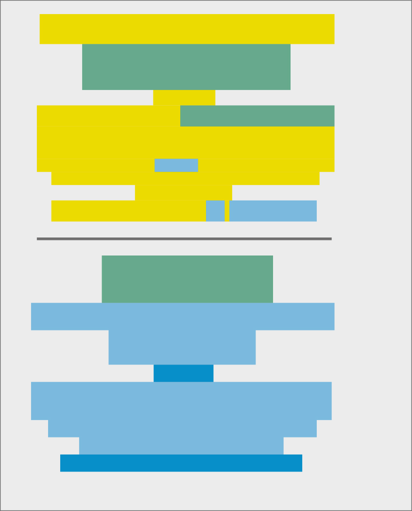
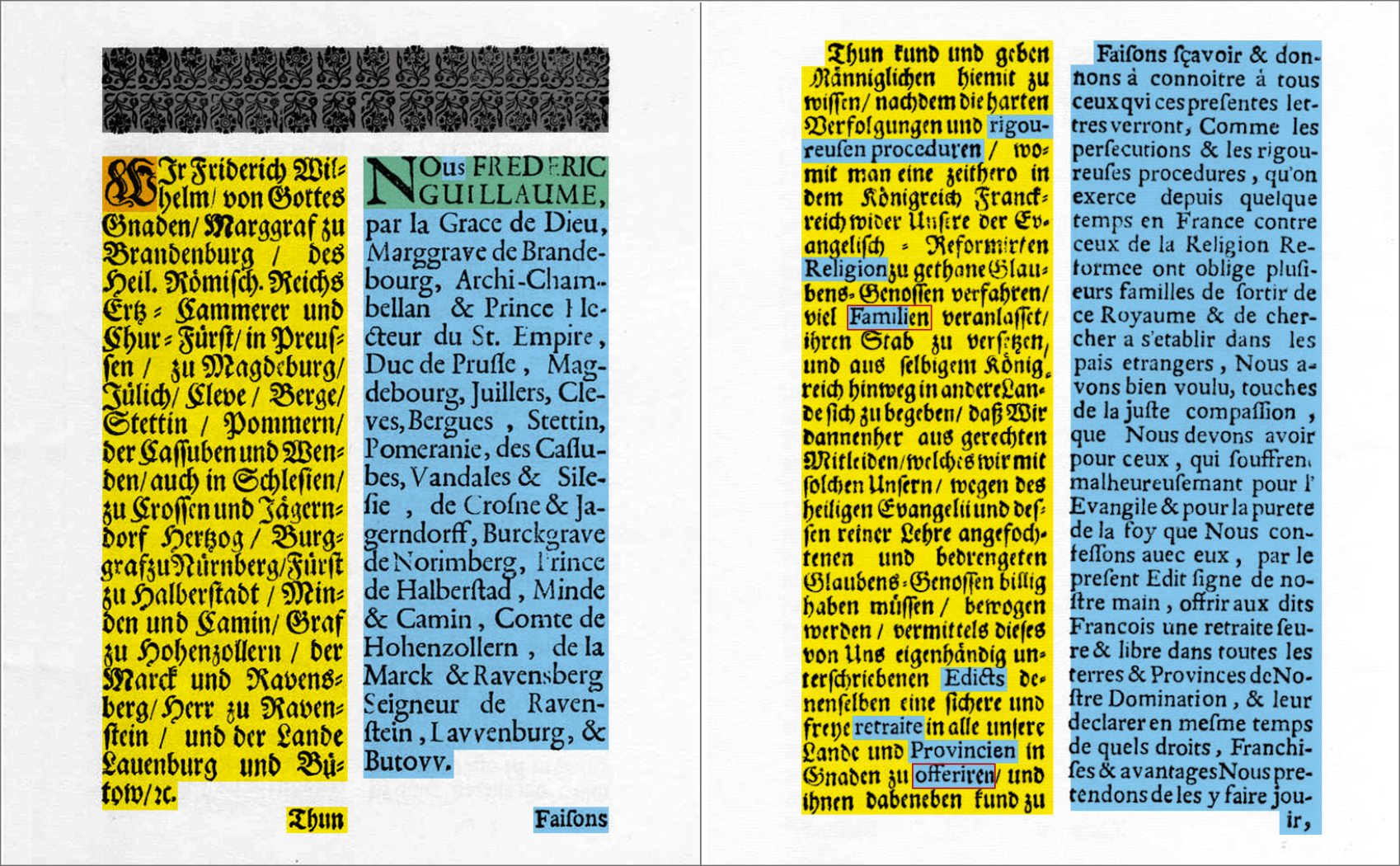
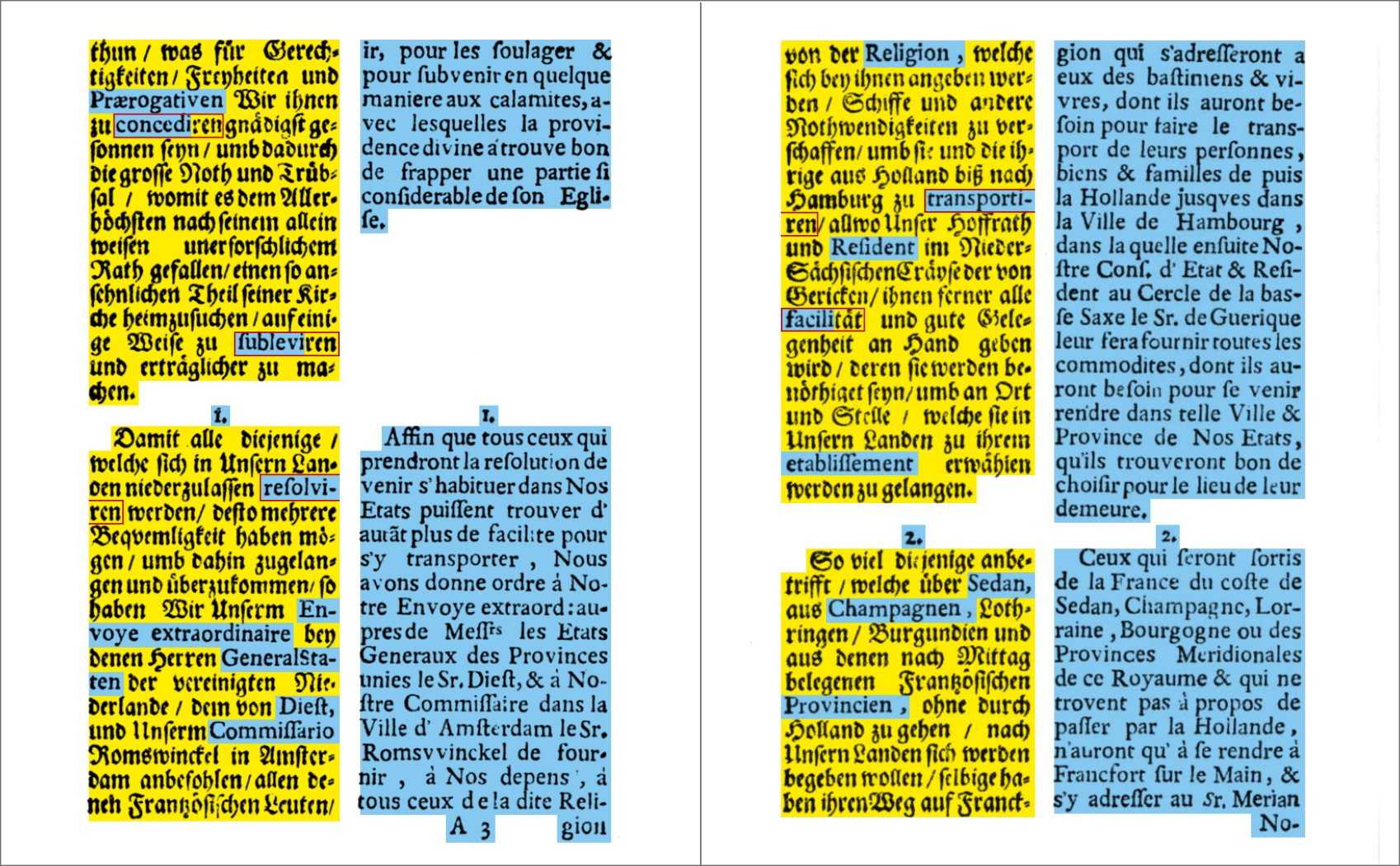
The Edict of Potsdam, issued by Frederick William of Brandenburg-Prussia in 1685, encouraged oppressed Huguenots to immigrate from France and granted them freedom of worship in their native French.6 This bilingual German-French version combines a vertically-arranged cover page (German above, French below) with horizontal juxtaposition of the languages (German left – French right) on the following pages. With regard to the 1806 sample shown later, the upper/left position was propably regarded as taking the leading role, followed by the lower/right position, therefore the German text would be presented as the more active part. While the German side features decorative forms in the first line to emphasize the representativeness of the medium, the French side shows italics, however in places of secondary importance. The main headline (“Edict/Edit”) is capitalized on both sides, making it shared in style (though not shared in terms of language). The version shown here has 19 pages, the back cover apparently being left empty.7
The beginning of the text is heralded by an ornament embracing both columns, German and French. It can therefore be defined as a shared element in the bilingual dramaturgy of the page, an ornament which ‘speaks both languages’ at the same time. On the German side, style-switching is present, while the same Roman typeface is used for the French column in the same size, despite a slightly differing cone mass/line height.
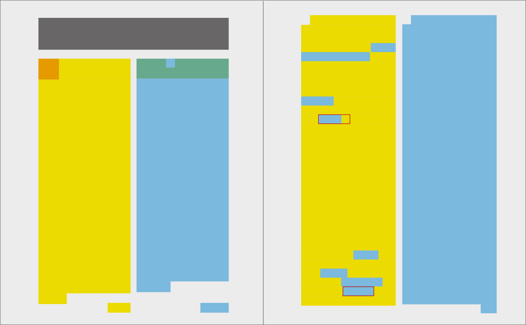
“Pages 2–3.
Pages 2–3, analysis.
The paragraph length, differing in both languages, is adjusted by blank lines to allow every paragraph start simultaneously. On a page not displayed here, a French paragraph is even cut by a page break in order not to foreclose content not yet present on the German side. The German paragraphs are, but one exception, longer than the French.
“Pages 4–5.
Pages 4–5, analysis.
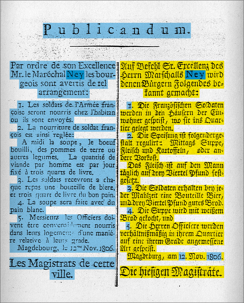
Cut to 1806. Napoleon Bonaparte’s Grande Armée had conquered Prussia. Throughout the country, announcements were published bilingually in French and German by the new authorities, in newspapers as well as on leaflets or posters. Although by that time, practice in ‘style switching’ had already been reduced to scientific, such as botanic terms, marshall Ney’s name seemed to have been too ‘French’ (and therefore too representative) to be printed in blackletters. Apart from that however, this sample shows a ‘bilateral and shared’ concept of multilingual typography, juxtaposing two different language versions of the same message, while sharing a Latin (sic!) headline.
“Publicandum […]”.
Analysis.
Experiments in style-switching typography (print, e-book and web)
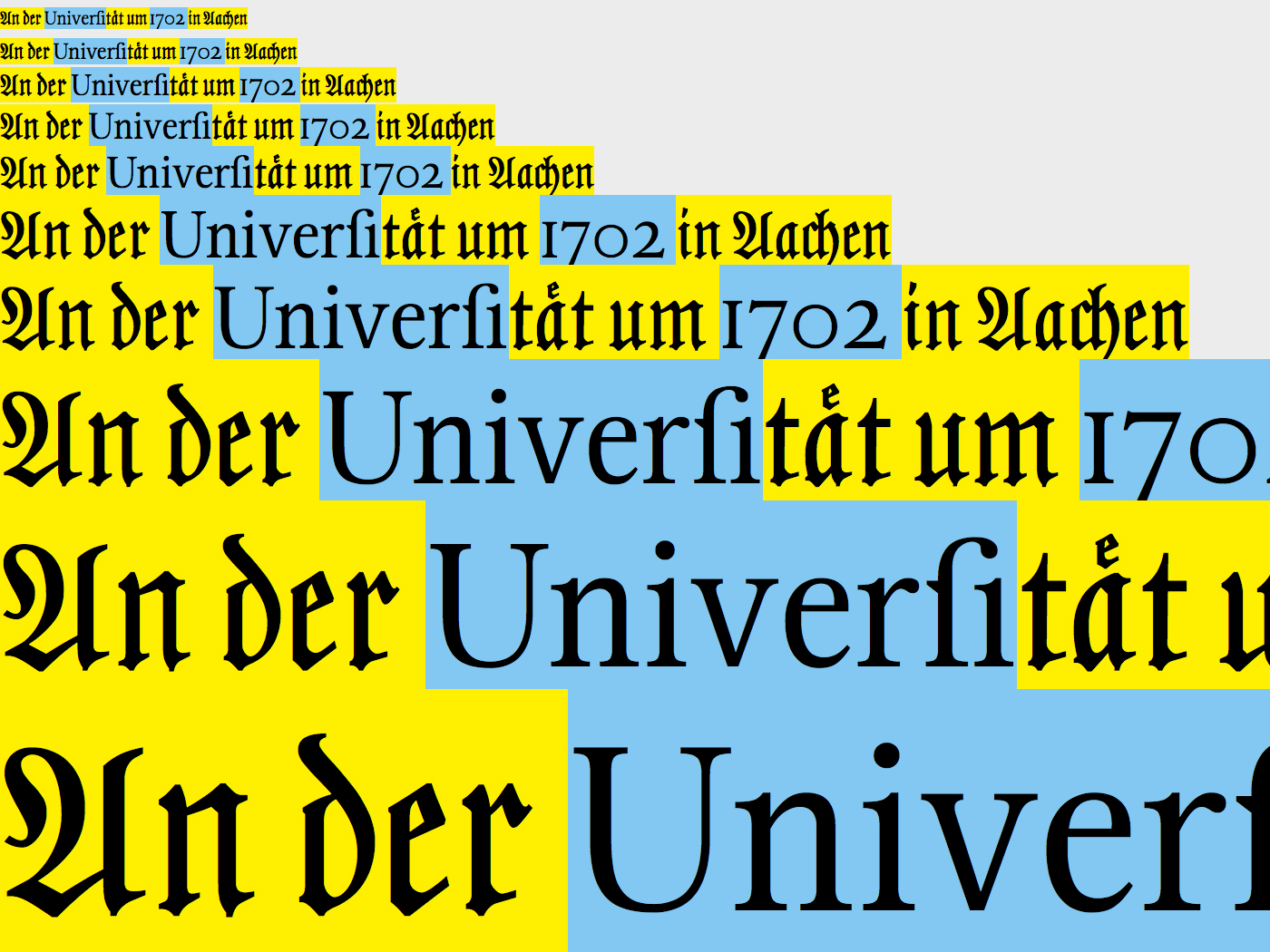
In my new multi-script (and, of course, multi-weight) typeface “Koex Text”, style-switching between Roman and blackletter is an integral part of the design concept. The font family is designed to serve simplicity and an intended ‘lack of character’ (German term “Charakterlosigkeit” in its positive sense). The blackletter drawing is mainly inspired by Prussian publications such as seen in samples 1 and 2, although the vertical metrics were more tightly adjusted to one-another. OpenType features such as onum; liga; and especially dlig; are required to meet the demands, as well as decorative caps under the swsh; feature. However, it is crucial to clarify that a letter such as ſ cannot be automatically substituted from s, being a matter of typing rather than coding, as well as the letter-accented forms, such as aͤ, which donot equal to their present-day equivalents (ä or adieresis), requiring the ccmp; feature to work properly.
An der Univerſitaͤt um1702 in Aachen An der Univerſitaͤt um 1702 in Aachen An der Univerſitaͤt um 1702 in Aachen An der Univerſitaͤt um 1702 in Aachen An der Univerſitaͤt um 1702 in Aachen An der Univerſitaͤt um 1702 in Aachen An der Univerſitaͤt um 1702 in Aachen An der Univerſitaͤt um 1702 in Aachen An der Univerſitaͤt um 1702 in Aachen An der Univerſitaͤt um 1702 in Aachen
Koex Text live webfont sample, to be compared to the screenshot on the right-hand side.
This is how the type should look like, using a browser supporting OpenType features, such as Mozilla FireFox.
These ligatures are important for the proper display of blackletter moveable type (among many others). Please compare their rendering to the screenshot on the right-hand side:
ch ck ll tz
However, only by proper OpenType coverage can they be displayed either online, in e-books or print typography. Support in all current browsers would be appreciated for more flexible representations of historic media in web and print.
First conclusions
I.
It can be stated that the convergence of blackletter and Roman typefaces in Prussian printed matter (in a main timeframe from around 1530 to the early 1700s) may well be regarded as a multilingual markup within German-language texts, because at the time, the idea of ‘foreign terms’ was not yet fully recognized as a fixed ingredient of national languages, but rather as an element of vivid Latin, then still an educated world language in its own right (‘lingua franca’). Only when the presence of Latin in literature and education receeded, around the year 1800, in favor of the ‘national language’, were terms of Latin origin fully re-defined as German ‘foreign terms’ and therefore no more regarded as to be highlighted by typographic means. We can thus consider the style-switching phenomenon as a multilingual texture within a unilingual text, highlighted by multi-style (though uni-script) typography.
II.
We can also conclude that many essential problems of multilingual layout can be found in the Prussian samples (mainly sample 4), as to decide which language takes the lead, which elements could be shared, how to organize the text in order to share a common rhythm on a double page or throughout the whole medium, etc. These questions are present all the same when it comes to multi-script typography, such as Chinese-English media in Hong Kong. Style-switching in Prussian media should therefore not be marginanlized in the context of multilingual typography research.
III.
Style-switching was also present in handwritings of the period, though not displayed here.
IV.
As seen in the first Lithuanian printed book (sample 3), it can be stated that style-switching is not exclusively a German phenomenon, but also present in early Polish and Lithuanian typography, thanks to the influence of letterpress offices in Gdansk, Königsberg and other cities.
V.
If we regard style-switching a markup method to display an understanding of languages which is different to today’s, it may make sense to pay more respect to this phenomenon in contemporary copies of the respective media. Digital typography (especially webfont technology) offers a multitude of ways to ease up the process even for non-typographers. High quality fonts are the key to a more divers and precise culture of historic reproduction, taking into account the materiality of type.
VI.
My own typeface development, the Koex Text family, actually serves as a medium to display parts of my own research in a coming publication on multilingual design. I am also planning to publish it and try to collaborate with academic institutions in order to achieve first results of its usage.
Here is a video of my talk at ATypI Warsaw on September 15, 2016.
For an overview, see Norman Davies: Vanished Kingdoms – The History of Half Forgotten Europe. Penguin, London 2011, and Karl Schlögel: Im Raume lesen wir die Zeit. Hanser, München 2003. A comprehensive source is from the field of library sciences, retracing the whereabouts of books from former Koenigsberg, with a special focus on letterpress workshops and languages involved: Axel E. Walter (Ed.): Königsberger Buch- und Bibliotheksgeschichte. Böhlau, Cologne 2004. An interesting Polish source about type foundries in the region is Andrzeja Tomaszewskiego: Giserzy czcionek w Polsce. Wydawnictwo Ogme, Warsaw 2009.
See Wilfried Stroh: Latein ist tot, es lebe Latein! Kleine Geschichte einer großen Sprache. Ullstein/List, Berlin 2007, and Jürgen Leonhardt: Latein – Geschichte einer Weltsprache. C.H. Beck, München 2009.
See Susanne Wehde: Typografische Kultur – Studien und Texte zur Sozialgeschichte der Literatur, p. 216 et seqq. Max Niemeyer Verlag, Tübingen 2000.
Leonhardt 2009 (ibid.), p. 148 et seqq.: “Latin was not the ‘other’ scholarly language, whose cultural vitality could be viewed as detached from the remaining linguistic development in Europe, but joining the other languages, sometimes leading, sometimes following.”
August Hermann Francke: Anstalten/ Die Zu Verpflegung der Armen zu Glaucha an Halle gemachet sind: Wie sich solche befinden Anno 1698/ im Monat JULIO. Kleine Texte der Franckeschen Stiftungen 4, Verlag der Franckeschen Stiftungen, Halle (Saale) 1998.
Please note that the edict was published and re-published in several different forms, containing unilingual versions in German.
There exact whereabouts of this copy is still left to be determined, although the Prussian State Library in Berlin is likely to be its location.


 Sound 聲音
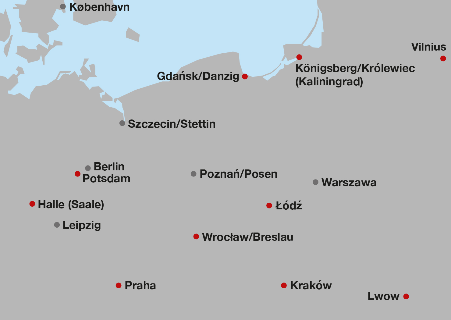
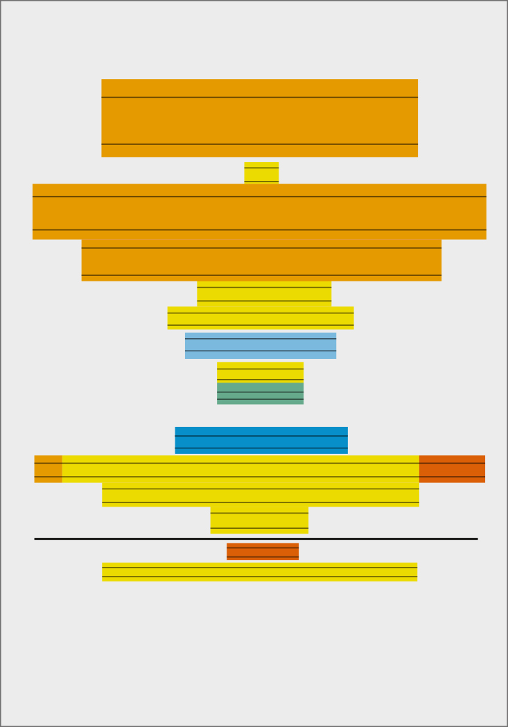
 Blackletter text type of various sort.
 Flourished blackletter (emphasis or headline).
 Other emphasis, such as capitalization of full words or parts of words.
 Roman serif (and Arabic numerals in the same style) of various sort.
 Emphasis in Roman italics.
 Emphasis in Roman capitalization.
 Images, clichees.